
Core and API
Design templates, module placement, and responsive UI
Build separate administration and customer interfaces with deliberate zones, permissions, mobile behavior, and theme tokens.
Guide overview
Before you start
- The required modules are listed for administrators and customers.
- Desktop and mobile target widths are known.
- A base theme is available.
Expected result
The same product uses an efficient builder interface in administration and a focused, usable storefront interface on every screen size.
Separate roles before placing modules
Administration templates may expose views, elements, drawing areas, variations, templates, diagnostics, and state tools. Customer templates should contain only the actions needed to personalize and purchase the product.
Permissions decide what a role can do; module placement decides where an allowed action appears. Configure both instead of relying on hidden CSS.
List actions per role.
Set permissions first.
Enable only the corresponding modules.
Save separate admin and customer templates.
Place modules by workflow
Use stable layout zones for primary navigation, contextual selection tools, bottom view switching, and temporary portals. Keep frequent customer actions reachable without opening several panels.
Icons, labels, pagination, tooltips, and contextual controls should remain understandable when translations expand.
Place navigation and view controls.
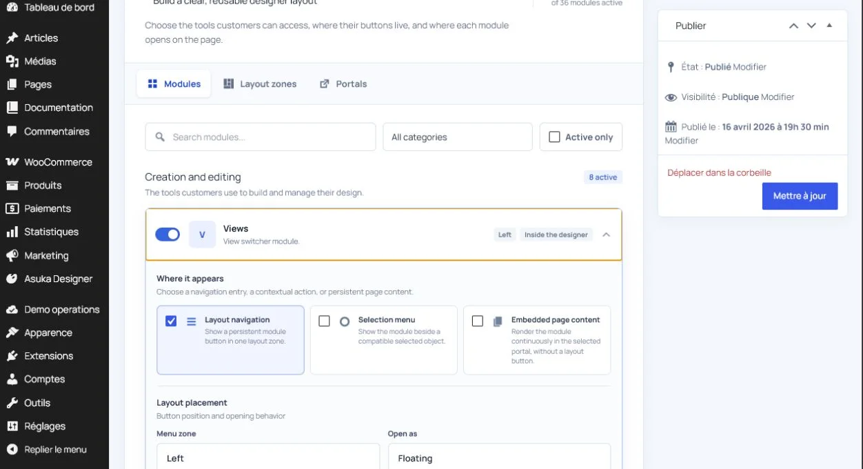
Configure contextual tools.
Set labels and icons.
Preview long translated strings.
Validate responsive behavior
On narrow screens, the canvas must keep a usable viewport while modules become drawers, bottom sheets, or scrollable panels. Fullscreen shells must constrain their content height so lower modules remain reachable.
Test touch targets, keyboard focus, safe-area insets, browser zoom, and orientation changes.
Preview desktop, tablet, and phone widths.
Open every module and portal.
Test fullscreen and embedded modes.
Confirm no control overlaps the canvas or checkout action.